What it does

What Anvesh draws from your data

Each kind of omics data on a cited pathway, with the statistics that come first.

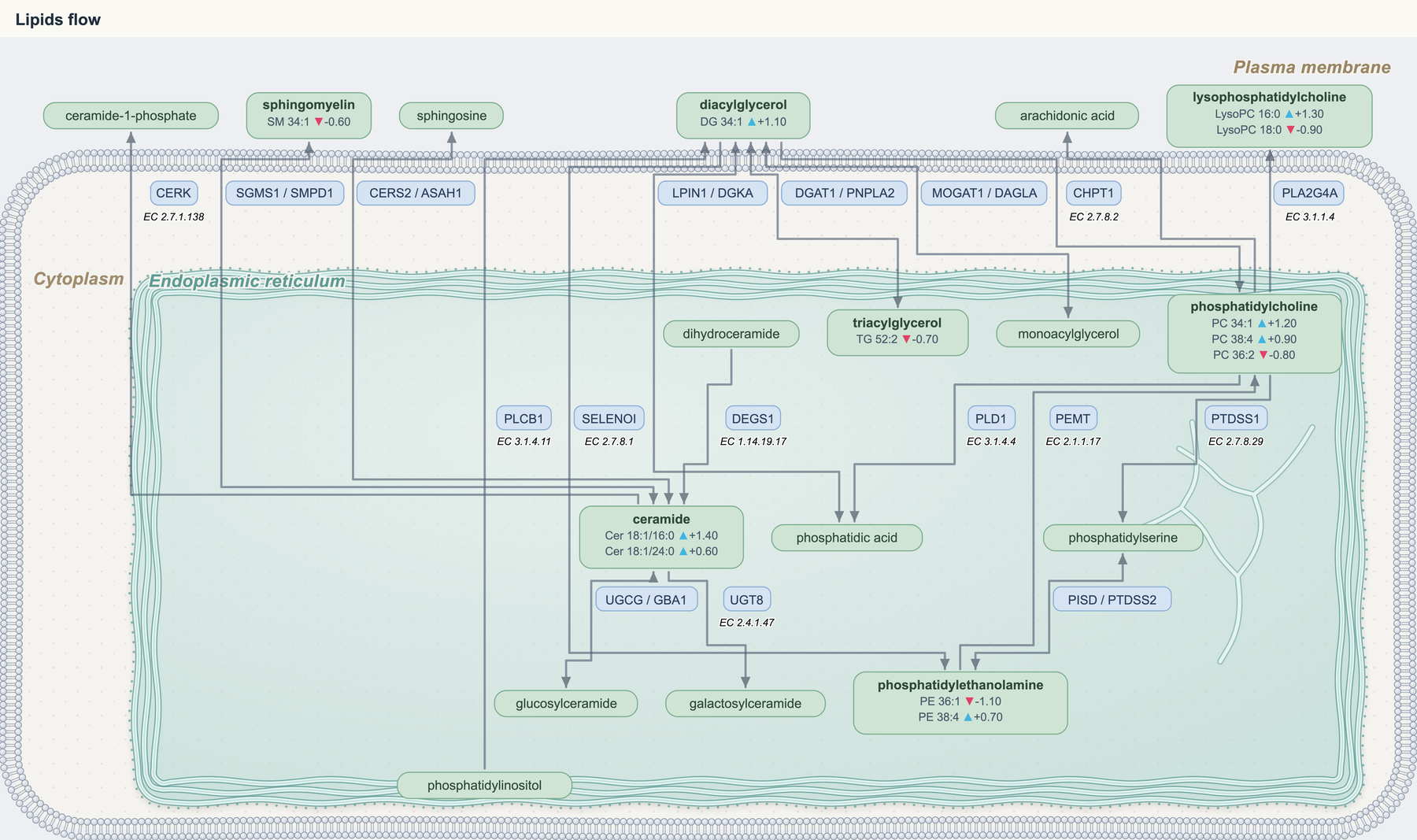
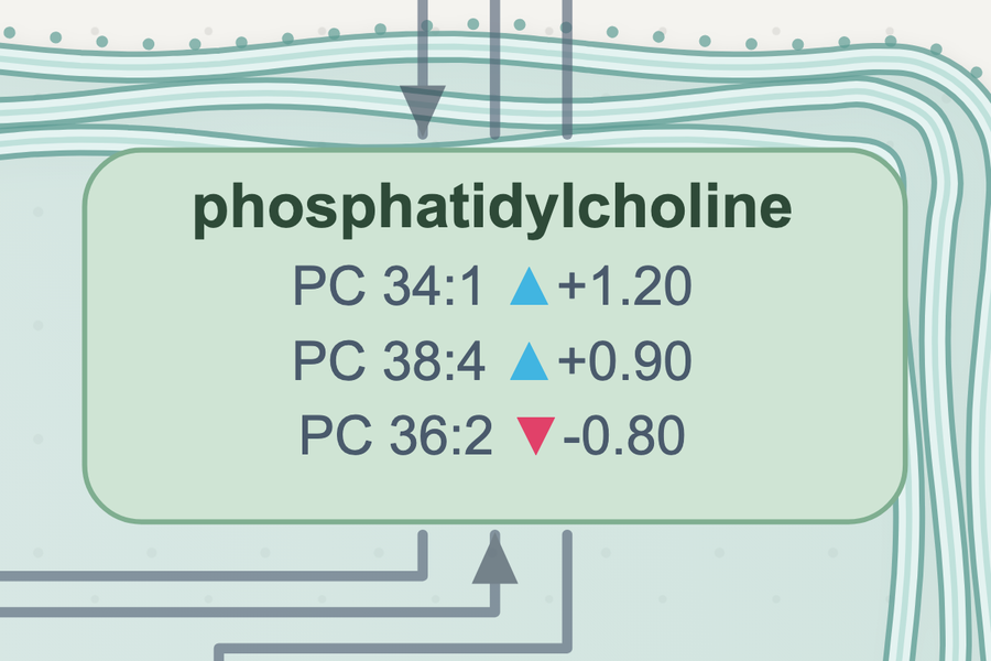
Look closer: every box carries your own values, down to each lipid species.

Lipid diagram exported from the Anvesh app, drawn in the cell with the endoplasmic reticulum

Exported from the Anvesh app (Lipidomics tab). Example values, not from any study.

Analyze

Look at your table first

Check your groups and cut-offs, then send the significant molecules to a pathway.

SpectronautMaxQuantDIA-NNCSV or Excel
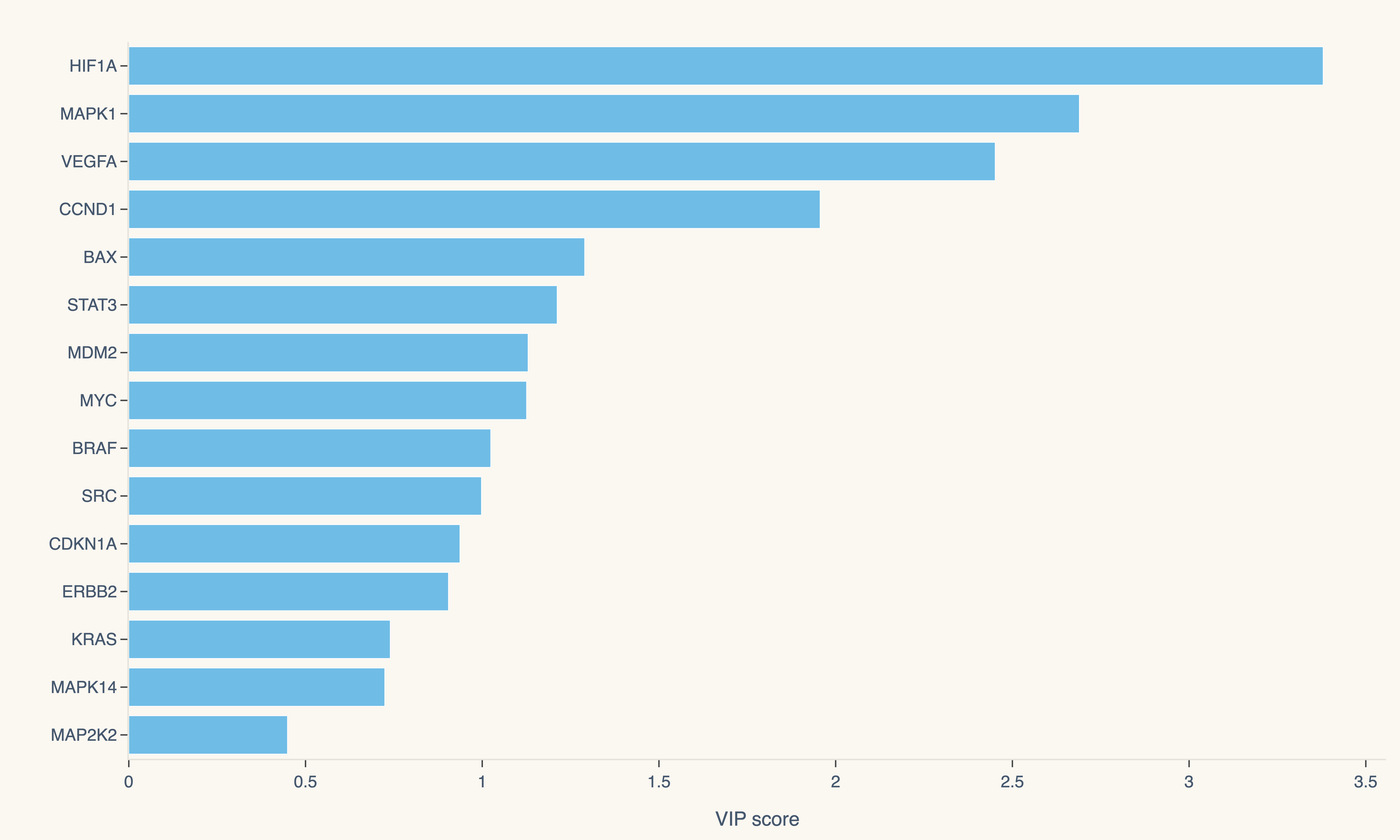
PCA sample map from the Anvesh appVolcano plot from the Anvesh appHeat map of hits from the Anvesh appVIP ranking from the Anvesh app
1

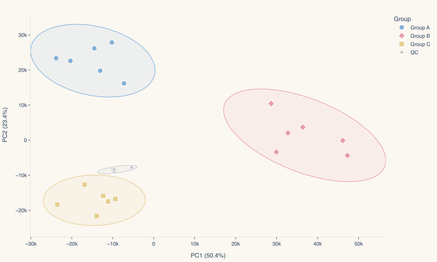
PCA sample map

See your groups separate and your QC samples sit together before you trust any test.

2

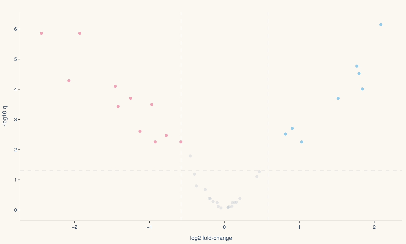
Volcano, your cut-offs

Welch, Student or paired test; FDR or raw p; your own fold-change cut-off.

3

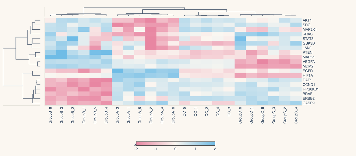
Heat map of hits

The significant molecules, clustered across every sample.

4

Straight to a pathway

One click sends the significant molecules to their pathway tab, with your fold-changes in the boxes.

→ Send to pathway analysis
The app's built-in proteomics example; example values, not from any study. Each picture is the app's own Export PNG.

By data type

Look closer

Proteins, sites, metabolites, lipids, plants and disease contexts.

Close-up: phosphatidylcholine box listing PC 34:1 up 1.20, PC 38:4 up 0.90 and PC 36:2 down 0.80
Lipidomics
Each lipid species keeps its own valueSpecies measured within a class sit inside the class box, each with its own fold-change, never averaged.
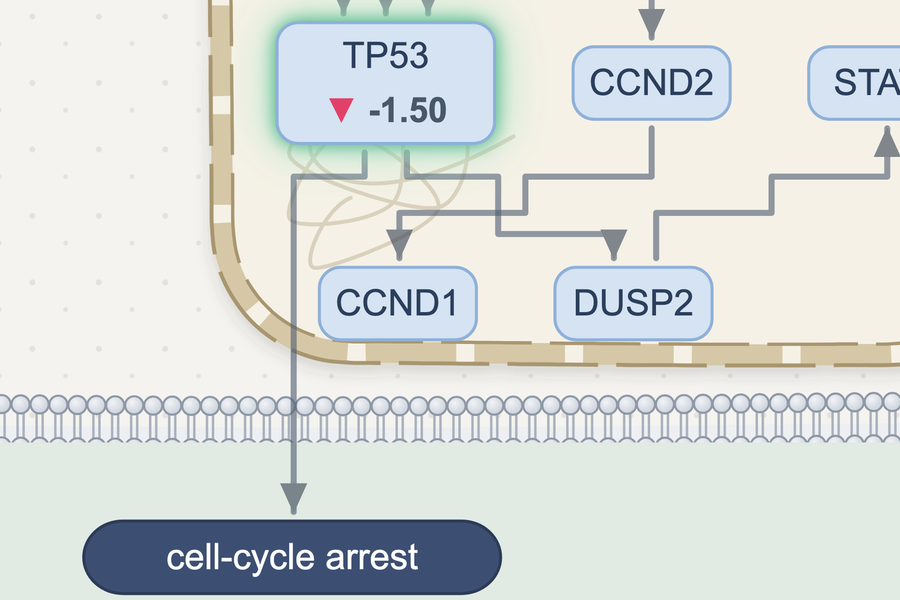
Close-up: TP53 box showing down 1.50 inside the nucleus, with an arrow down to cell-cycle arrest
Disease areas
From your change to what it leads toTP53 down in your data, in the nucleus, and the process it leads to below the cell. Research use only, not clinical.
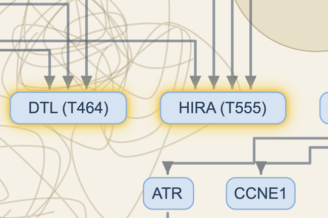
Close-up: phosphosites PGR (S400), DTL (T464) and HIRA (T555) with their halo
Phosphoproteomics
The site belongs to the substrateKinases point to the residue they phosphorylate; on its own tab, the phosphatases that remove it.
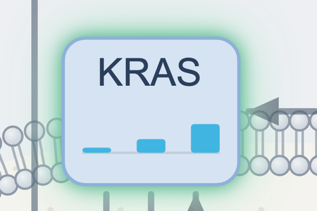
Close-up: KRAS box with three rising bars for three time points
Time course
A time course inside the boxPaste values for several time points and each box shows them as small bars, in order.
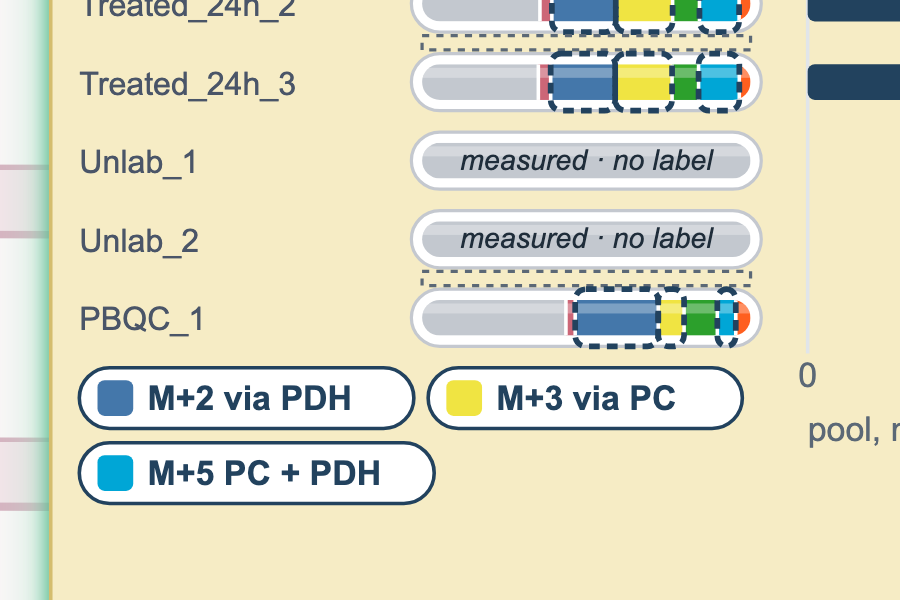
Close-up: citrate labelling bars with route tags M+2 via PDH, M+3 via PC and M+5 via both
Tracer
What each M+ can meanLight up one isotopologue across the pathway, with notes from published papers on the routes that can make it.
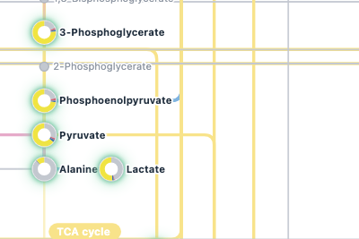
Close-up: Atlas labelling rings on 3-phosphoglycerate, phosphoenolpyruvate, pyruvate, alanine and lactate
The Atlas
Your molecules on the metabolism mapThe Atlas lights up your molecules on one overview map, on every tab.
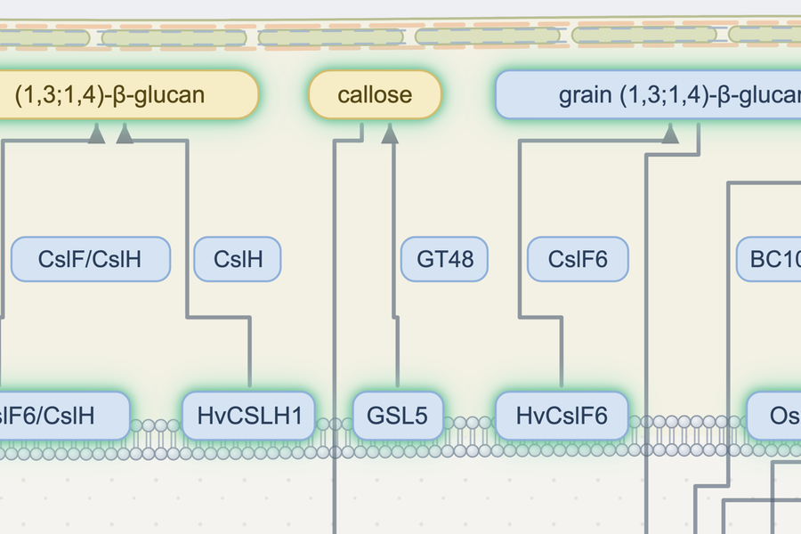
Close-up: the plant cell wall with (1,3;1,4)-beta-glucan, callose and the CslF and CslH enzymes
Plants and crops
Inside the cereal cell wallBarley (1,3;1,4)-β-glucan and cellulose biosynthesis, drawn from the cell-wall literature including García-Gimenez et al. 2020 (Plant J).
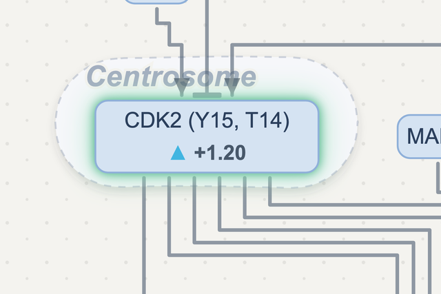
Close-up: CDK2 (Y15, T14) up 1.20 inside the centrosome
Compartments
In the place it sitsCDK2 drawn at the centrosome, with its sites and its fold-change.

Every close-up is cut from the Anvesh app's own exports; example values, not from any study. Atlas: map style after the metabolism overview in Nelson & Cox, Lehninger Principles of Biochemistry, 8th ed. (Fig. 13-28). Layout and reactions are Anvesh's own; each reaction is cited.

After the diagram

More ways to read the same list

Which pathways your list falls in, where each connection comes from, how two lists differ, and how labelling changes over time.

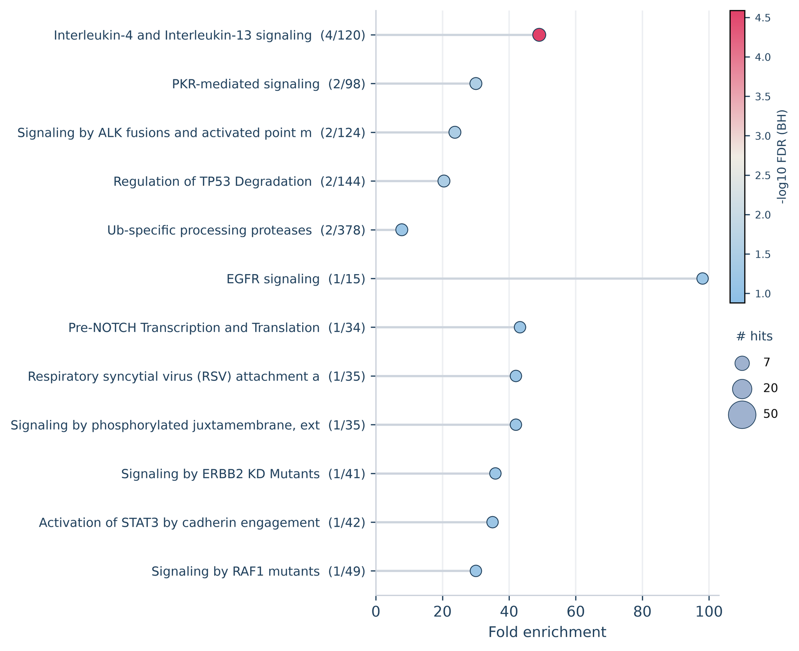
Pathway enrichment lollipop chart from the Anvesh app
The Sources bar: 84 connections, 74 primary-cited, 9 stated in review, 1 no citation yetConnection rows with species, the quoted sentence where Anvesh has it, and the PubMed link
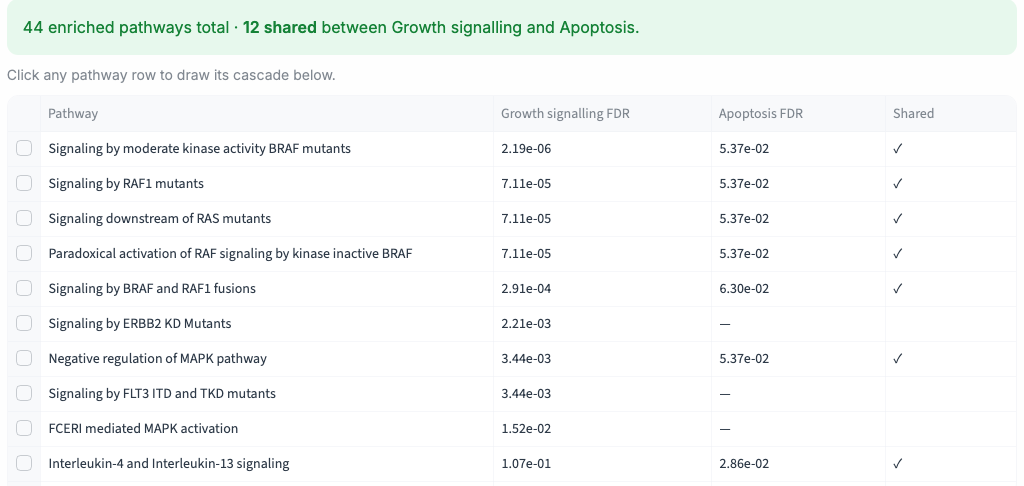
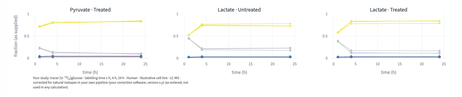
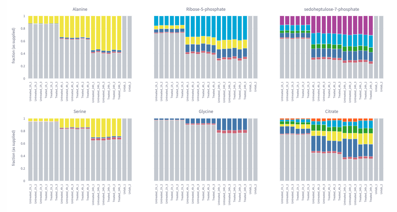
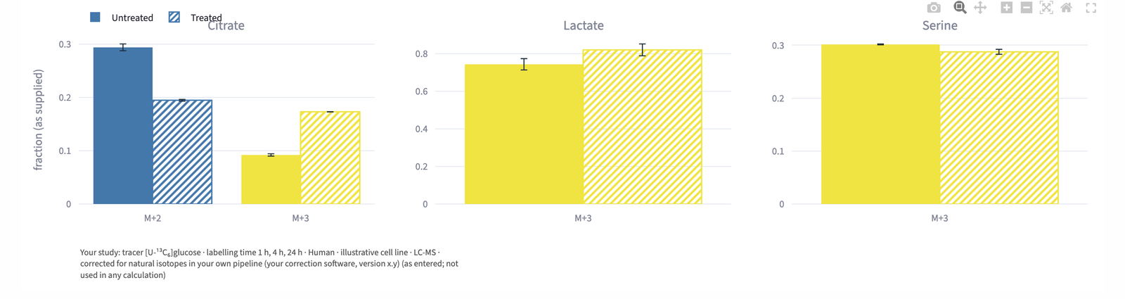
Compare tab: 44 enriched pathways, 12 shared between two lists, with each list's FDR Tracer time course: labelling fractions over 1, 4 and 24 hours Tracer labelling stacked by sample for six metabolites Tracer group summaries: mean labelling per group with error bars
1

Which pathways your list falls in

An enrichment chart for orientation; click a pathway and Anvesh draws it with your values.

2

Where each connection comes from

The Sources bar counts primary papers and reviews; each row carries its species, its paper and, where we have it, the sentence.

3

Compare two lists

Put two lists side by side and see the pathways they share and those unique to each.

4

Labelling over time

Each labelled form across your time points, as you supplied it.

5

Every sample, side by side

The labelling of each sample in one row of bars, group by group.

6

Group summaries

Mean labelling per group, with error bars.

All from the Anvesh app: its own exports or screenshots of its pages. Example values, not from any study.

Your report

Figures, connections and sources in one file, in the full version.

Try the demoPaste your own molecules and click an arrow to read its source.
Send us your dataset for a trialOptional: we run one of your published datasets through Anvesh and send back the cascade and its report, so you can see what it makes before you use it yourself.